The scikit-learn main website has got a brand-new appearance since version 1.5, with migration to the PyData Sphinx theme along with other UI/UX improvements. Thanks for the theme developers and whoever involved in the conversations. You may want to check out #28084 that tracked the migration progress and #29038 that did the final merge.
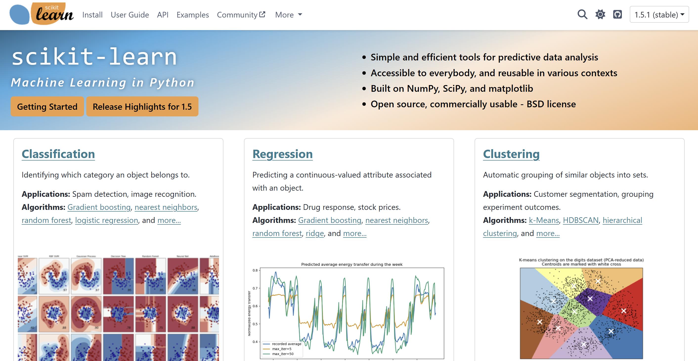
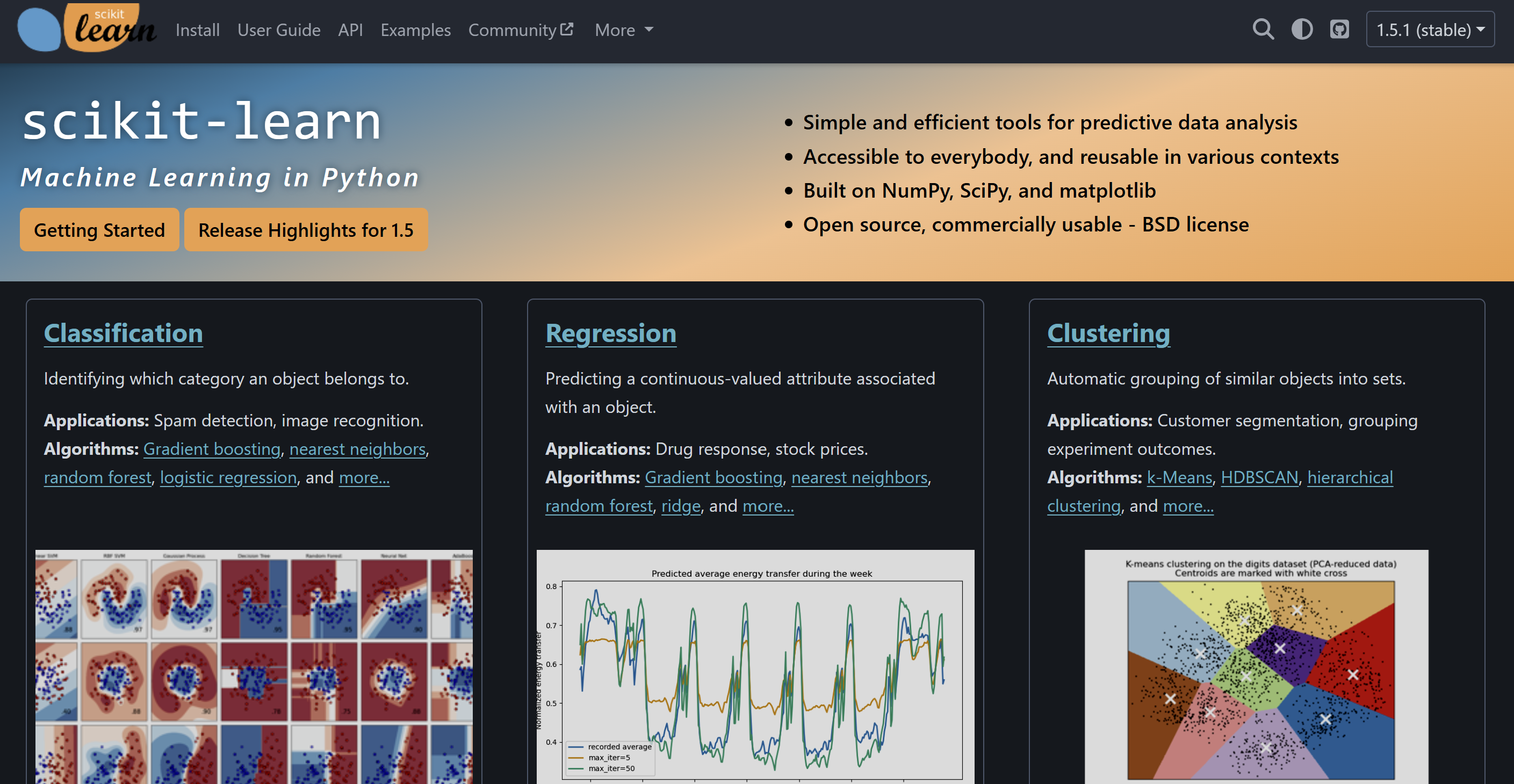
Dark Theme
PyData theme has built-in support for light and dark themes as well as the theme switcher. In particular we adapted dark theme support for our customized landing page as well, while retaining the old appearance as much as possible. See #28331 for technical details.
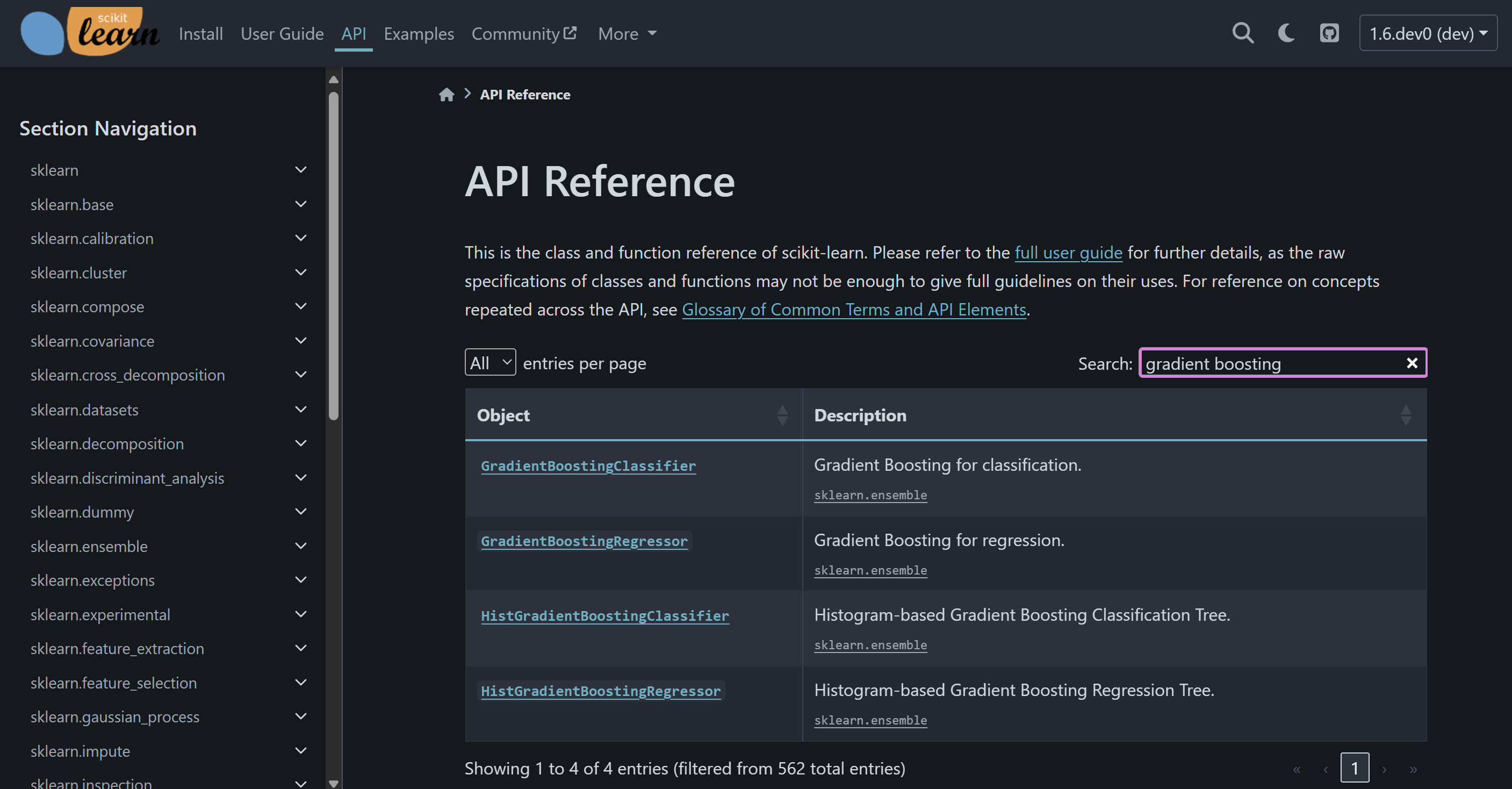
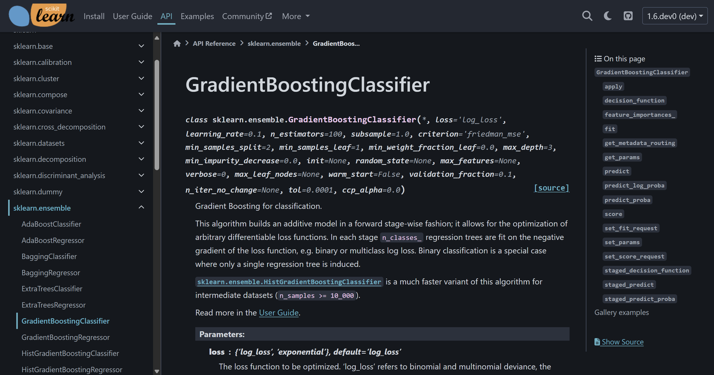
Reworked API Pages
The API pages are reworked. In particular, the index page now contains a search-as-you-type table of all APIs powered by DataTables, and the primary sidebar now lists APIs in hierarchy. Moreover within each API page, the secondary sidebar now has links to all methods and gallery examples (if any). All these UI/UX changes are meant to provide better navigation experience. See #28428 for technical details.
Reworked Dropdowns
The dropdowns (i.e., folded sections) were redesigned based on the dropdown feature of Sphinx Design. Except for all its built-in features, we implemented permalink anchor for each dropdowns and the toggle all dropdowns functionality. The latter is because certain browsers (e.g., Firefox) does not search into collapsed dropdowns, so we provide the ability to unfold all with one click. See #28401 for technical details.
Reworked Installation Guide
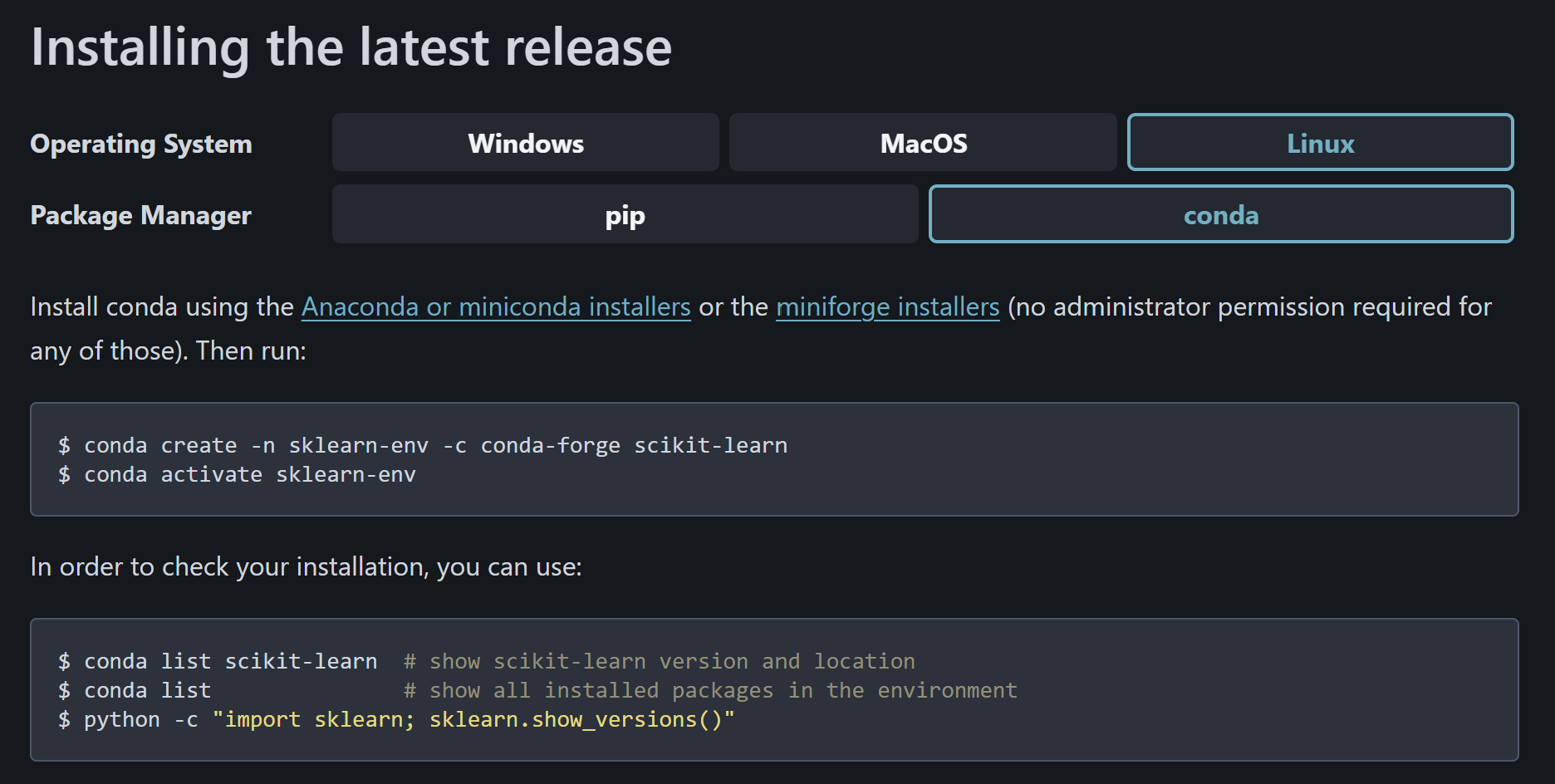
The installation guide is reworked. In particular, the previous implementation for switching between instructions for different operating systems and package managers was minimal and unpolished. With the tabs feature of Sphinx Design along with some customizations, we worked out the new more native-looking and powerful installation guide. See #28336 for technical details.
Enhanced Gallery UI
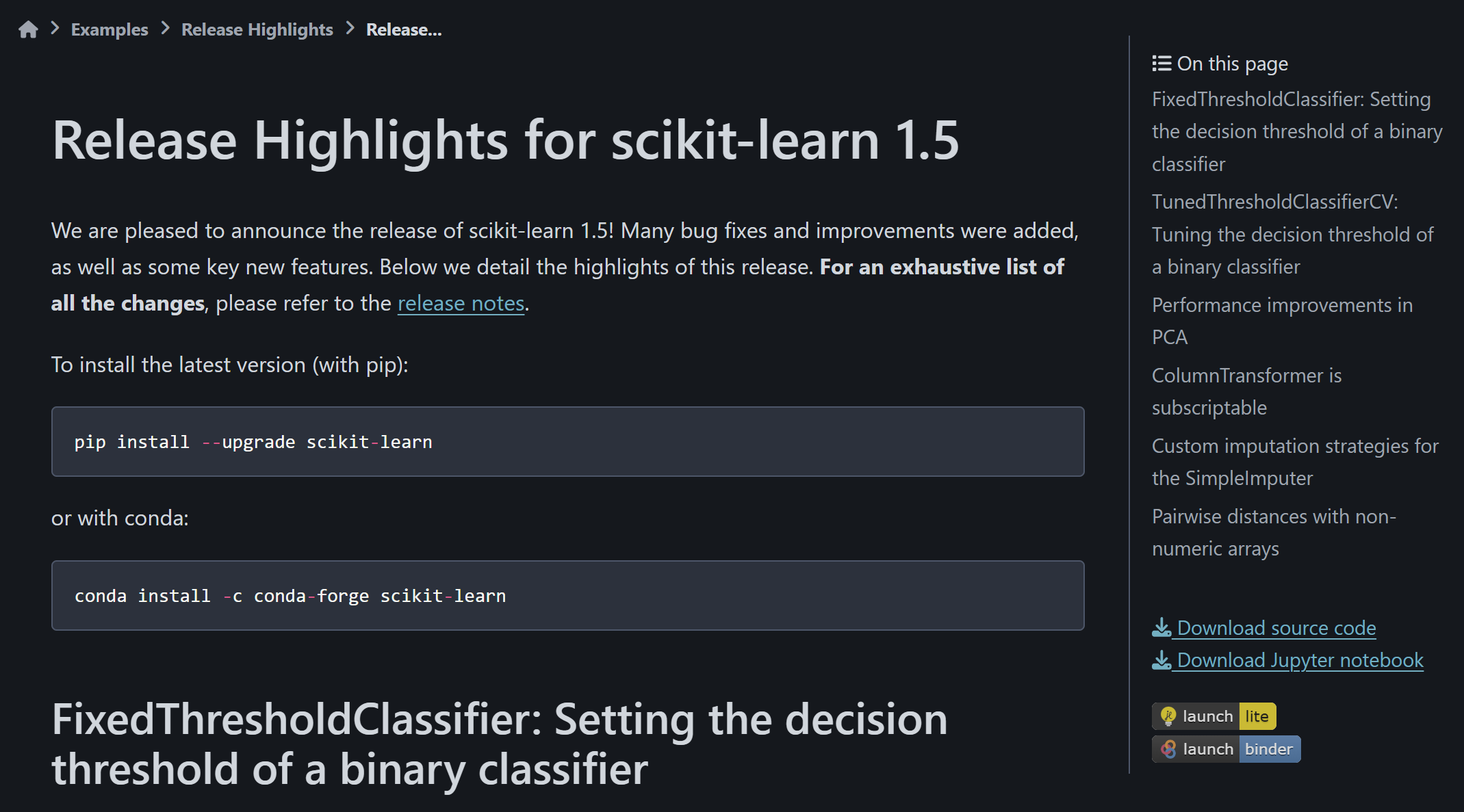
Previously the badge links to JupyterLite and Binder launchers as well as the download links of Python source code and Jupyter notebooks lived at the bottom of each page, with a hint at the top of the page linking to the bottom. With the three-column layout of the PyData theme, these information are all moved to the secondary sidebar (on the right side) for better UI/UX. See #28512 for technical details of our temporary workaround and sphinx-gallery/sphinx-gallery#1312 for my better solution upstream.
Conclusion
There are many more small improvements in the website and technical details that I want to share, but due to the limited space, I encourage you to visit the scikit-learn website and explore the new theme yourself. We are still continuously making improvements to our docs, and new versions of dependencies sometimes break out customizations. Feel free to report in the scikit-learn issue tracker if you have nice ideas for improvements or if you have found anything broken. Many thanks again to the theme developers and people involved!