Note
Go to the end to download the full example code or to run this example in your browser via JupyterLite or Binder
Plot class probabilities calculated by the VotingClassifier#
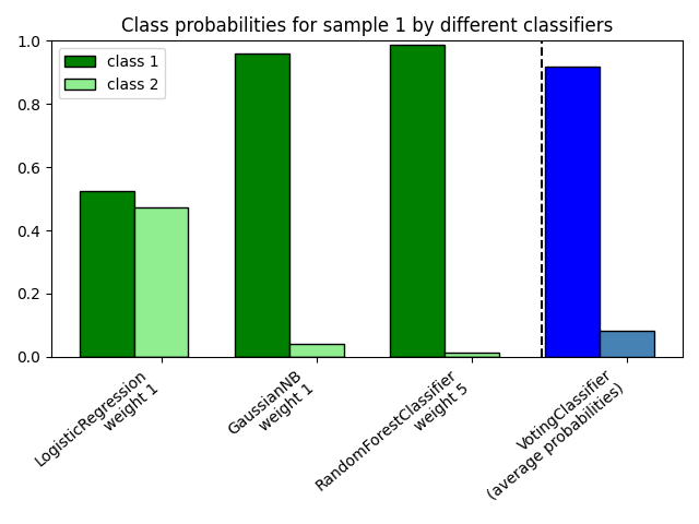
Plot the class probabilities of the first sample in a toy dataset predicted by
three different classifiers and averaged by the
VotingClassifier.
First, three exemplary classifiers are initialized
(LogisticRegression, GaussianNB,
and RandomForestClassifier) and used to initialize a
soft-voting VotingClassifier with weights [1, 1, 5], which
means that the predicted probabilities of the
RandomForestClassifier count 5 times as much as the weights
of the other classifiers when the averaged probability is calculated.
To visualize the probability weighting, we fit each classifier on the training set and plot the predicted class probabilities for the first sample in this example dataset.
import matplotlib.pyplot as plt
import numpy as np

from sklearn.ensemble import RandomForestClassifier, VotingClassifier
from sklearn.linear_model import LogisticRegression
from sklearn.naive_bayes import GaussianNB

clf1 = LogisticRegression(max_iter=1000, random_state=123)
clf2 = RandomForestClassifier(n_estimators=100, random_state=123)
clf3 = GaussianNB()
X = np.array([[-1.0, -1.0], [-1.2, -1.4], [-3.4, -2.2], [1.1, 1.2]])
y = np.array([1, 1, 2, 2])

eclf = VotingClassifier(
    estimators=[("lr", clf1), ("rf", clf2), ("gnb", clf3)],
    voting="soft",
    weights=[1, 1, 5],
)

# predict class probabilities for all classifiers
probas = [c.fit(X, y).predict_proba(X) for c in (clf1, clf2, clf3, eclf)]

# get class probabilities for the first sample in the dataset
class1_1 = [pr[0, 0] for pr in probas]
class2_1 = [pr[0, 1] for pr in probas]


# plotting

N = 4  # number of groups
ind = np.arange(N)  # group positions
width = 0.35  # bar width

fig, ax = plt.subplots()

# bars for classifier 1-3
p1 = ax.bar(ind, np.hstack(([class1_1[:-1], [0]])), width, color="green", edgecolor="k")
p2 = ax.bar(
    ind + width,
    np.hstack(([class2_1[:-1], [0]])),
    width,
    color="lightgreen",
    edgecolor="k",
)

# bars for VotingClassifier
p3 = ax.bar(ind, [0, 0, 0, class1_1[-1]], width, color="blue", edgecolor="k")
p4 = ax.bar(
    ind + width, [0, 0, 0, class2_1[-1]], width, color="steelblue", edgecolor="k"
)

# plot annotations
plt.axvline(2.8, color="k", linestyle="dashed")
ax.set_xticks(ind + width)
ax.set_xticklabels(
    [
        "LogisticRegression\nweight 1",
        "GaussianNB\nweight 1",
        "RandomForestClassifier\nweight 5",
        "VotingClassifier\n(average probabilities)",
    ],
    rotation=40,
    ha="right",
)
plt.ylim([0, 1])
plt.title("Class probabilities for sample 1 by different classifiers")
plt.legend([p1[0], p2[0]], ["class 1", "class 2"], loc="upper left")
plt.tight_layout()
plt.show()
Total running time of the script: (0 minutes 0.327 seconds)
Related examples
Plot the decision boundaries of a VotingClassifier
Probability Calibration for 3-class classification

