Note
Go to the end to download the full example code or to run this example in your browser via JupyterLite or Binder
Plotting Validation Curves#
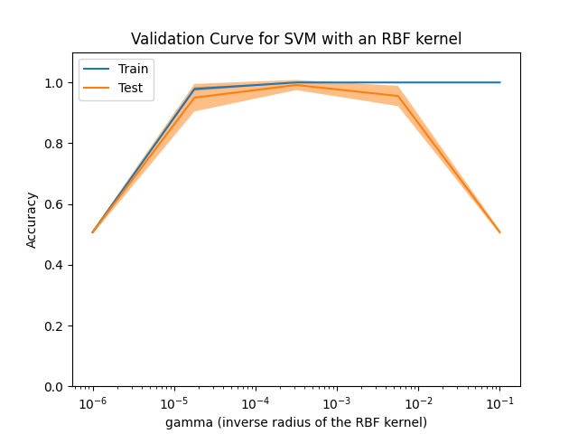
In this plot you can see the training scores and validation scores of an SVM for different values of the kernel parameter gamma. For very low values of gamma, you can see that both the training score and the validation score are low. This is called underfitting. Medium values of gamma will result in high values for both scores, i.e. the classifier is performing fairly well. If gamma is too high, the classifier will overfit, which means that the training score is good but the validation score is poor.
import matplotlib.pyplot as plt
import numpy as np

from sklearn.datasets import load_digits
from sklearn.model_selection import ValidationCurveDisplay
from sklearn.svm import SVC

X, y = load_digits(return_X_y=True)
subset_mask = np.isin(y, [1, 2])  # binary classification: 1 vs 2
X, y = X[subset_mask], y[subset_mask]

disp = ValidationCurveDisplay.from_estimator(
    SVC(),
    X,
    y,
    param_name="gamma",
    param_range=np.logspace(-6, -1, 5),
    score_type="both",
    n_jobs=2,
    score_name="Accuracy",
)
disp.ax_.set_title("Validation Curve for SVM with an RBF kernel")
disp.ax_.set_xlabel(r"gamma (inverse radius of the RBF kernel)")
disp.ax_.set_ylim(0.0, 1.1)
plt.show()
Total running time of the script: (0 minutes 1.020 seconds)
Related examples
Plot different SVM classifiers in the iris dataset
Explicit feature map approximation for RBF kernels

